
Top Ten Tuesday is hosted by That Artsy Reader Girl.
The prompt for today was to talk about book covers that either were solely composed of type or used mainly typographic elements. I cannot think of many designers that design more beautiful covers than Jessica Hische.

Hische is a letterer, author, and a Brooklyn transplant to the Bay area. I think I probably discovered her work in/around 2010 when she was working on her popular Daily Drop Cap series as a way to keep motivated and keep designing between freelance gigs. Everyday (or at least regularly), she’d publish a different letter in a different style. I think all told there were 12 complete alphabets between 2009-2011, as well as a guest illustrated series.
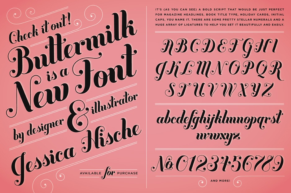
Within months, it was being talked about all across the far reaches of the internet. I encountered her while I was just starting to dip my toe in the calligraphy waters and looking for alphabet inspiration. I found, and still find, her forms to be so beautiful. Somehow even the ones that are supposed to be kind of creepy and gothic are still approachable, full of gorgeous curves. The fonts on her site that you can buy have names like Buttermilk and Brioche, words calculated to show off her ascenders, show off the forms of the letters, but also words which covey mood and tone. Everything looked different, but still had undeniable style. And the fact that the style was fun, often bubbly, and vintage inspired makes everything she does feel like a glass of champagne–worth toasting.
“If you feel like you know Jessica Hische a bit from her output, you might not be all that off-base, and you certainly wouldn’t be alone. It’s been written that her work has “personality,” but it might be more accurate to say that her work has presence—her presence. In my experience, what you see is really what you get.”
Zachary Petit, Design Matters Media Editor-in-Chief

Even though I was primarily doing calligraphy, I found a lot more of my inspiration looking to lettering artists than calligraphers in particular. Calligraphers often had absolutely spellbinding mastery of the technique and medium, but they were largely working in older, established styles, and I wanted to work in more of the tone and mood that other letterers use.
See more of her work here: https://jessicahische.is/working
Now she’s gotten much, much more recognition, such as being named in Forbes’ 30 under 30 list in design, she’s become a children’s book author in her own right, and she’s worked with some of the biggest names you can work with across a huge spectrum of industries.

Besides doing the design work for her own books, she’s also designed the drop cap series of Penguin classics, worked on the probably familiar range of classics for Barnes & Noble, and has designed work for numerous other books.
Book covers are somewhat unique in design industries, I think, because the artist’s name actually goes on the book. While most design products don’t give their designers credit, book covers do. I’m sure that must be an attractive aspect of doing lettering work–because if someone likes the cover of a book they know exactly who to commission. And it adds an element of pressure because if you don’t capture the book, well…. your name lives on it forever. But I don’t think Hische really needs to worry about that.

“reading the book I’m doing the cover for gives me more conceptual and visual inspiration than spending a day in a rare books library”
Jessica Hische, in an interview with The Everygirl

Taking just her cover for Oscar Wilde into consideration, we can see some of the direct inspiration for the text. Everything is beautiful, but it still has hard, even sharp edges (the little triangles on the capitals as well the serifs) while still staying true to the Victorian aesthetic the book cultivates and critiques. The paisley flourishes call to mind peacock tails (and their associations with beauty and vanity). Also, while all the covers feature some kind of border, this cover is one of the only in the series that can be said to have a frame.
Even though I haven’t touched a calligraphy pen for a while now, I still find lettering and typography to be intensely interesting. It’s just another way to make you feel something when you look at a word or a phrase and I’m fascinated by how forms and art influence our perception of words and things more generally. And seeing how lettering can bring books to life is so inspiring to me. I encourage you to seek out Jessica Hische’s work–there’s so much more than I could possibly show here and I love how they all take direct inspiration from the books themselves.
Do you have a favorite typographic cover? Let me know in the comments.

Leave a comment